A Dynamic Wine Menu System
PACKAGING
2024
Project done
at Kavya Bagga Design
Team
Kavya Bagga
Aditi
Pratiksha
Nikhil Soren
Sporting Club Delhi signifies the rebirth of top tier professional football in the nation’s capital. Established in 2025 through the rebranding and relocation of Hyderabad FC, the club ushers in a new era defined by renewal, ambition, and resilience. Inspired by the phoenix embedded within its identity, Sporting Club Delhi embodies the spirit of rising from the ashes, transforming legacy into forward momentum. The brand reflects strength, unity, and perseverance, channeling Delhi’s competitive energy while fostering community pride and a long term vision for excellence in Indian football.
The Context
The Leela Palace New Delhi runs a wine program spanning hundreds of labels across multiple restaurants. Inventory shifts. Prices change. New vintages arrive. And the menu is expected to reflect all of it in near real-time.
That's not a design problem. That's an operations problem that looks like a design problem.
What Was
Actually Broken
Before this system, the property used a basic folder with standard A4 printed sheets. The approach required minimal design thinking or effort. But it showed. Pricing sat misaligned, spacing was inconsistent, and the overall feel was closer to a government document than a menu at one of India's finest hotels. The format itself wasn't the issue—it was the absence of a design language and structure capable of supporting a serious wine program.
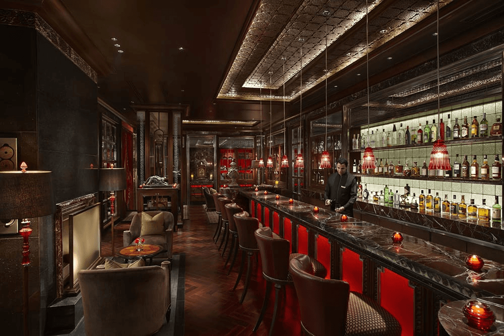
The menu didn't reflect the property. That gap was felt.
Reframing the Brief
[ * ]
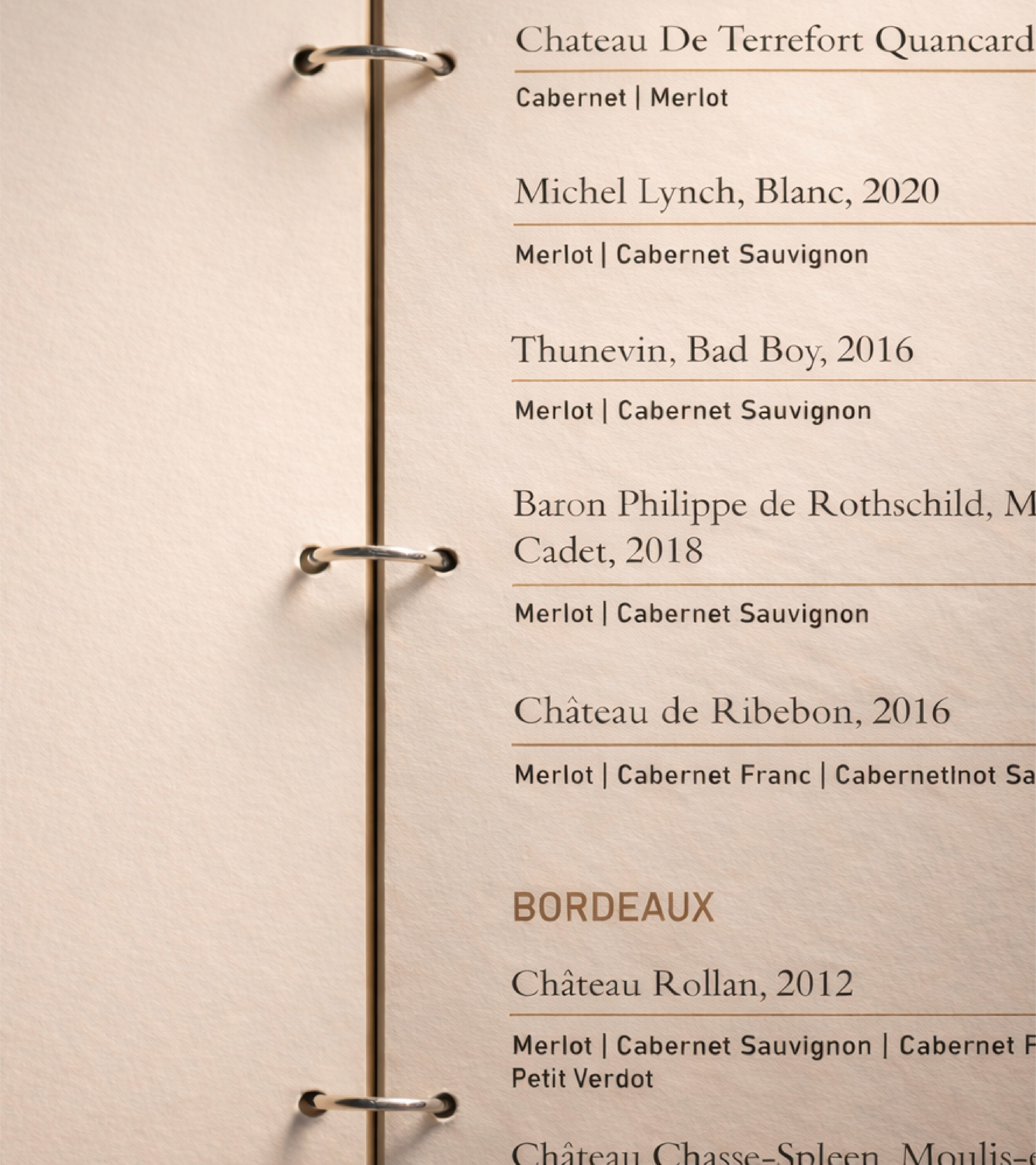
Modular Architecture
The menu was broken into independent, replaceable pages. Each page is a self-contained unit that can be pulled, updated, and reinserted without touching anything else. A price change on a Burgundy page doesn't require reprinting the Champagne section. Updates are surgical.
This single structural decision is what makes everything else possible.
[ ** ]
Format as Infrastructure
The tall, slim format wasn't chosen for aesthetics. It was chosen because it works. Long wine lists need vertical scanning. Narrow pages force information to stack cleanly, reducing the visual noise that comes from wide, sprawling layouts. The format also creates a consistent page-to-page rhythm, which matters when pages are being swapped in and out regularly.
[ *** ]
A Controlled Editing Environment
Templates were built in Figma with locked layout, typography, and spacing. Only the text fields are editable. This means a sommelier or F&B manager can update content directly, with no designer in the loop and no risk of someone accidentally shifting a column or changing a typeface.
The tool was chosen for control, not creative freedom.
[ **** ]
Spiral Binding as a Functional Choice
Spiral binding is typically a cost-cutting move. Here it's an operational one. Pages can be removed and replaced without damage to the cover or spine. The binding isn't a style decision. It's the mechanism that makes the modular architecture physically real.
[ ***** ]
In-House Production
The full update workflow collapses to three steps: content change, edit, print, replace. No external vendor. No approval chain. A pricing update that previously took days now takes an afternoon. The menu stops being a scheduled production item and becomes part of daily operations.
CONTENT CHANGE
EDIT IN FIGMA
PRINT IN-HOUSE
REPLACE THE PAGE
The Visual Layer
Solving for scale doesn't mean accepting a utilitarian result. The visual layer was designed to ensure the system still feels like The Leela.
[ 01 ]
Illustrated Section Dividers. Illustrations drawn from vineyard and winemaking imagery act as breaks between categories. They give the eye somewhere to rest inside a dense document, and introduce a sense of craft and narrative that lists alone can't achieve.
[ 02 ]
Surface and Material Restraint. Pages use a warm-tinted base rather than stark white. Textures are subtle, almost imperceptible. The goal is to reduce visual fatigue across long reads and to create a sense of depth that feels considered rather than decorated.
[ 03 ]
A Fixed Footer System. Every template carries a consistent footer with no manual work required. It anchors each page visually and creates continuity across an ever-changing set of inner pages.
[ 03 ]
A Stable Outer Cover. A leather-like folder with embossed branding holds everything together. The cover never changes. It carries the identity of the property while the pages inside move freely. The tension between the permanent exterior and the dynamic interior is exactly the point.
Outcome
The system enabled real-time updates across multiple restaurant outlets. Routine changes no longer require designer involvement. Production time and cost dropped significantly. And the menus maintained the visual quality expected at a five-star property, not in spite of the system, but because of it.
What This Project Is Really About
Good design at scale is rarely about the artifact. It's about removing friction from the people who have to maintain it.
This project worked because the system was designed around how the operation actually runs, not how it should run in theory. Every decision, from the binding to the template structure to the format ratio, was made to reduce dependency while maintaining standards.
The best outcome isn't that the menus look beautiful. It's that no one has to call a designer to change a price.
A system designed to change constantly, without ever appearing inconsistent.
See more
Youngdabang Brand Identity
Youngdabang Brand Identity